- We are customer-focused, providing an unparalleled level of service
- We focus on streamlining the overall process, reducing lead times and costs
- We are based in Southern California and can provide quick customization services with manufacturing facilities in China and Mexico
- We are able to supply fine craftsmanship without the penalty of expensive prices
- Innovative invisible tilt bar solution with improved productivity and reliability
- Wave shutter louvre part


Online Ordering
- To order online, please click Create an Account.
- Login and click the Order menu button.
- Follow the instructions to become a retailer.
A Powerful Partnership
Benefits
- Enhance profit margins by eliminating steps of distribution and related costs
- Compressed supply chain to ensure lower wholesale pricing than leading competitors
- Quick turnaround rate ensures prompt delivery to increase your revenue generation
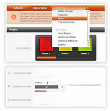
Preset Styles
Access the Style Control settings from Admin → Extensions → Template Manager → rt_camber_j15 → Settings.
Simple configure the options, then save and Gantry will automatically load the modified preset to your site.
Color Chooser Settings
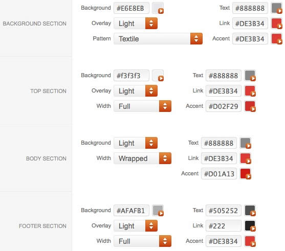
A Color Chooser template uses CSS color values, combined with transparent overlay images, to determine its color and style. Therefore, you can change the entire color scheme via the Gantry Administrator. The available options are outlined below:
Other Style Settings
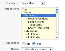
Assigning a Style to a Specific Page
With Gantry, the ability to assign a certain style to an individual page has never been easier and/or more efficient. Just follow these simple steps:
Gantry Framework: Per Menu Item ControlsLogo Editing
Gantry sets the dimensions of the logo, so CSS modification is unnecessary.
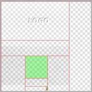
Step 1 - Open the File
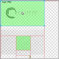
Step 2 - Text/Slogan/Icon Editing
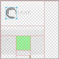
Step 3 - Slice Modification
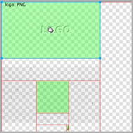
Step 4 - Export
Step 5 - Multiple Frames/States
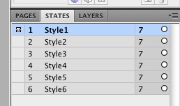
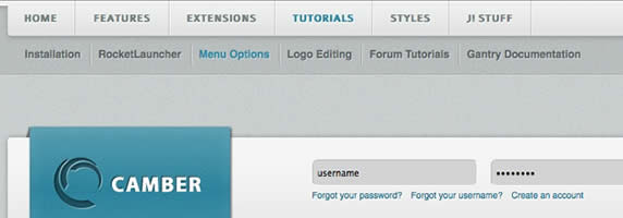
Menu Options
Please ensure you are using the latest version of RokNavMenu, available here.
Configuration
Go to Extensions → Template Manager → rt_camber_j15 → Menu Control → Set Menu Type, to find all the parameters for Fusion Menu and Splitmenu, such as transitions, duration and sublevel position.
Descriptions of each template parameter can be seen when you mouseover the label of each option.
Fusion with MegaMenu
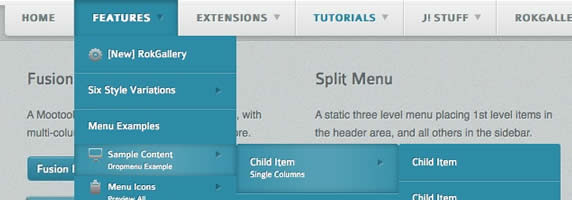
Fusion Menu is a menu theme of the RokNavMenu extension, the addon that drives all RocketTheme template menus. It is primarily a javascript enhanced CSS dropdown menu, that combines standard suckerfish type functionality with animations, transitions and other advanced effects powered by Mootools.
- 1/2/3/4 Column Modes
- Custom Column Widths
- Custom Menu Width
- Menu Item Grouping
- Item Distribution Controls
- Animation Controls
- Transition Controls
- Duration/Delay Controls
- Opacity Controls
- Per Item Styling
- Inline Modules
- Inline Positions
- Menu Item Subtext
- Menu Item Icons
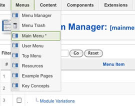
All Menu Items can be edited from Admin → Menu → Menu Name → Menu Item.
Basic Fusion Parameters
Advanced Fusion Parameters: Columns
Menu Columns
Columns of Child Items allows you to determine how many columns the Fusion dropdowns are presented in. You can have anywhere between a single dropdown to a four column dropdown.
Item Distribution
Item Distribution allows you to control how the menu items are ordered in the dropdowns:
NOTE: If your Columns of Child Items setting is configured to be 2 or more columns, you will need to manually set the column widths and distribution, as outlined below. The default is 180px which is too small for multiple columns.
Drop-Down Width (px)
Drop-Down Width (px) determines the total width of the dropdown, regardless of how many columns are shown. This option is to be used in conjunction with Column Widths (px)
Column Widths (px)
Column Widths (px) determines the width of each Column. Separate each width by a comma. The final column's width is determined automatically. This option is to be used in conjunction with Drop-Down Width (px)
Below are some example configurations:
Advanced Fusion Parameters: Groupings
What is Grouping?
Group Child Items changes the behaviour of child items in the dropdown menus, instead of creating a dropdown for the immediate sublevel, this option places them inline. See below for an illustrated example of the differences:
Configuration
NOTE: Grouping cannot be applied to root items, only child items.
Set Group Child Items to Yes to activate the mode. The sublevels well then appear below the parent menu item in a categorical type structure.
Advanced Fusion Parameters: Modules
Fusion is now capable of loading individual modules or entire module positions inside its dropdowns.
Splitmenu
A static menu system that displays 1st and 2nd level items in the main horizontal menu and further children in the Sidebar.
Code Modification: Remove the Menu in the Title
Open /templates/rt_camber_j15/html/modules.php and change:
<?php echo $menu_title_item->name.' '.JText::_('Menu'); ?>
To
<?php echo $menu_title_item->name; ?>
How to create Child / Sublevel menu items
Go to Admin → Menu → A Menu → A Menu Item → Select a Parent Item, and it will appear as a child of it.
Installation Instructions
Note: The Bundle Template is only necessary if the Gantry Library is not installed at /components/com_gantry.
Template Installation
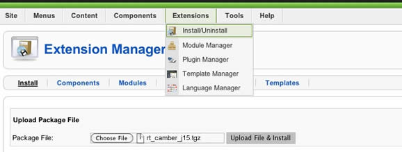
Step 1 - Installation
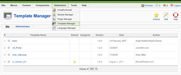
Step 2 - Template Default
RocketLauncher Instructions
Note: All sample content images will be replaced with blank versions in the RocketLauncher version.
RocketLauncher is a customized Joomla install, that installs a replica of the demo onto your site - inclusive of sample data, content, extensions, the template and sample images.
We always recommend installing a RocketLauncher first to trial and understand the template more efficiently. It must be installed as new, and not over an existing Joomla install.
Step 1 - Upload
Note: You can upload all the files via FTP, or use cPanel or SSH to upload the zip and unzip directly onto the server. Enquire with your hosting provider.